Monday, 4 January 2016

Rough Cut Evaluation


Feedback : 
The class did love our ideas, and liked the video we pieced together, they liked the variety of shots and the quality of the camera made our video look proffesional. They also did like the the fact how the lipsyncing bits were in time with the song and how the whole idea matched with the song. 


  • Mahira is over exaggerating in one small part, and the class would like us for her to make her reaction more naturalistic 
  • Where the song starts the character should be seen lip syncing rather than a nature shot. 

Digipak Draft 3


Diary Entries - Filming

https://www.youtube.com/watch?time_continue=37&v=CA8LJWdxt9s
(The link above does say a little about what we done and what we had used as well as how effective it was.)

11.12.15 - Mufti Day
As it was only me Ramneek and Ansa in today, we filmed short bits of Ramneek with his friends, because of course Mahira isn't his only friend, but is his main friend, so we wanted to show the contrast of how he is with his friends and then with Mahira. It was perfect, as we had mufti day, so it seemed like the boys were just out with one another.  We did side on shots of the boys talking, as well as them walking and talking towards 'their bench'. Something Miss Carter picked up on was that one of the boys was wearing his ID badge, and that small error shows that he is in school rather then out with the boys, but as we did not have much time, I don't think we will be using that small shot of them.

14.12.15
Dear Diary,
Today Ansa was in charge, and we had Mahira do her lip syncing. As from the class our feedback on one part of the video, was that Mahira standing infront of a tree with her glasses on and in formal clothes. The class and miss Carter said it changed the atmosphere of friends into more of a formal outlook, so we had changed that into her without her glasses (otherwise it wouldn't go along smoothly with the rest of the video - she has her glasses off throughout the video) but again in that place, to show where she and Ramneek made the most memories.


16.12.15
Dear Diary,
Today after school we had focused filming Ramneek and Mahira's friendship bit. We had gone onto the back field and had them shoot hand shakes and hugs (which represent what friends do). Also within this bit of shooting, the video will show you how much their relationship has progressed, with them talking by themselves, flirting and even sharing a laugh or too. Me and Ansa were in charge of camera, and took a variety of shots, including; long shots, closeups, medium shots, and even low angle shots.  I did enjoy taking close ups of them two, again to the audience it shows how close they do grow as friends. Another thing we shot today was transitions without the song, which I feel really go with the song, and the story.

Step by Step of Poster/Digipak

Poster:

  1.  I started off with paint, and had used a lighter tone of black for the background.
  2. Looking into other indie bands, I liked the idea of the white border, to have the fans glued to the middle of the page focusing on the band then looking elsewhere. (Did again with paint) 
  3. With the font, it was easy enough to again stick too paint and see what matched, as a group we went back and forth with different fonts and decided Lucida Handwriting and Roman Apprentice worked well with each other. 
  4. With the circle, I used photoshop, in which I got photos off the internet of different flowers, and had cropped them in a circular shape, making sure to make them different layers, and once I had done that with one of the photos, I did the exact same with the second. I then placed the layers on top of each other. I did this till I got to the same width and length of our first logo. I also used a brightening tool on Photoshop to make the red flowers pop against the blue background. Also with every other red circle, I blurred them, I was just going through each effect within photoshop and it seemed blurring every other red flower circle just worked. 


Final Poster


How we improved our poster to end to this result, was with sticking with the colour scheme of the font, and again sticking with two different fonts. The idea of the two fonts is because of our ideas, fantasy(fairytale and love) both contrast nicely with one another, and this goes along with our fonts for our poster. We've also made one of our own idea of the circles, mixing the idea of flowers seemed to work (also the previous circle also consisted of flowers). We changed the colours slightly, but made sure they seemed to match with our old idea. Also another thing i did, was that i made the background all one colour, unlike our previous idea, which had a lighter version of black as well as black, and it just didn't look neat nor professional.


Digipak draft 2 Branding

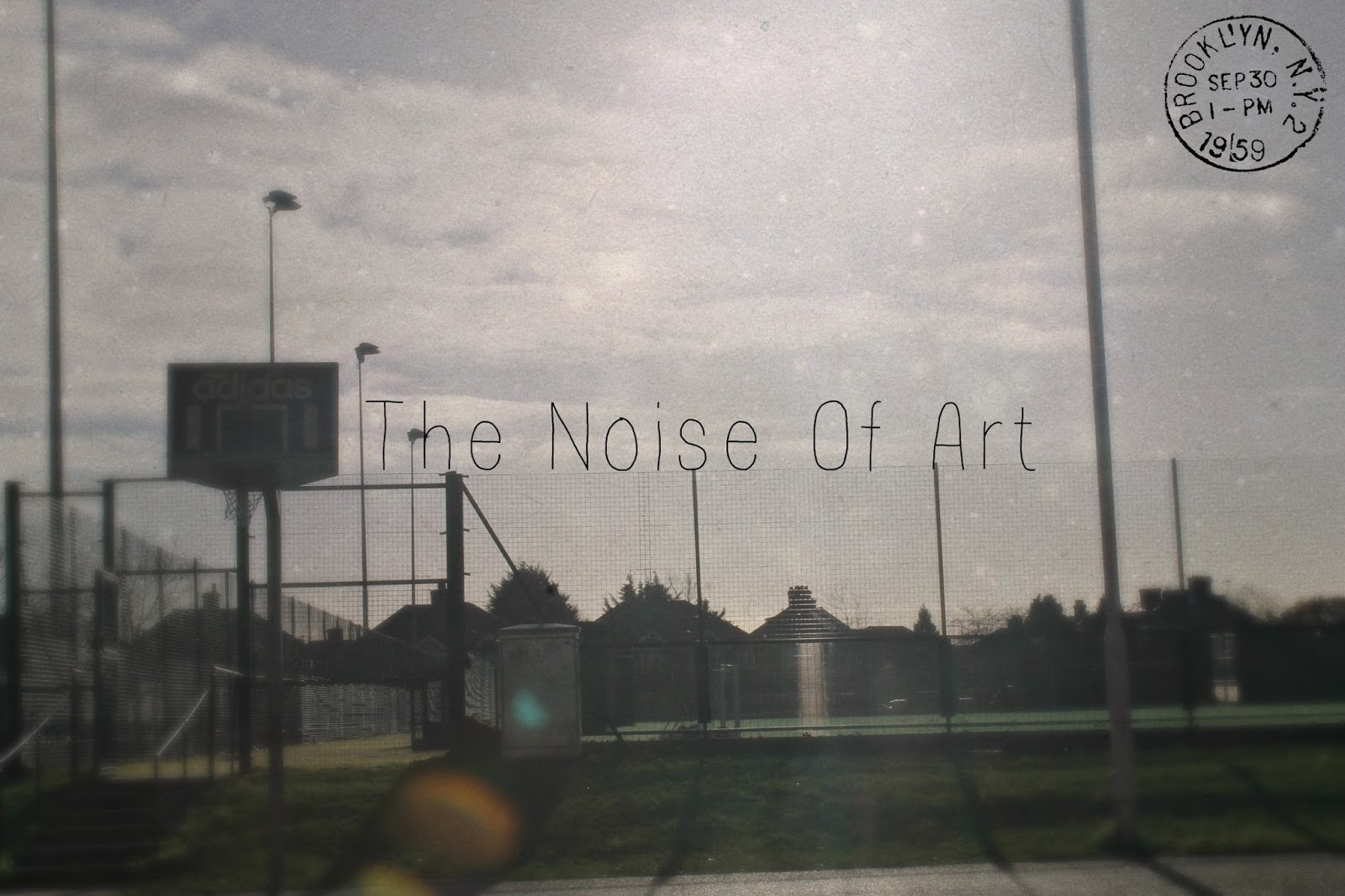
We then good feed back from the class, and what really stuck out to me, was the fact that the photo we had was not our own photo. We then thought too research the most common factors of an indie pop band cover, and it seemed to be really blurry pictures with just the fixture on the middle, a post card type cover or even just a simple photo of the band in a naturalistic background. Out of all the photos we took, I feel this picture captured the name of our band perfectly, as well fitting too the criteria of an indie band. The only thing that I forgot to put was our logo we had stuck with from the beginning, it was hard matching it to the picture, so i decided to swap it with a small stamp, as if the cover was a postcard. 
With the inside of our digipak, we left the idea of a book behind, and kept it nice and sleek, with having black backgrounds with photos of the singers on the inside, and as well as having a sweet thank you note from the band and having a page telling the fans of the upcoming dates. 


Digipak draft 1


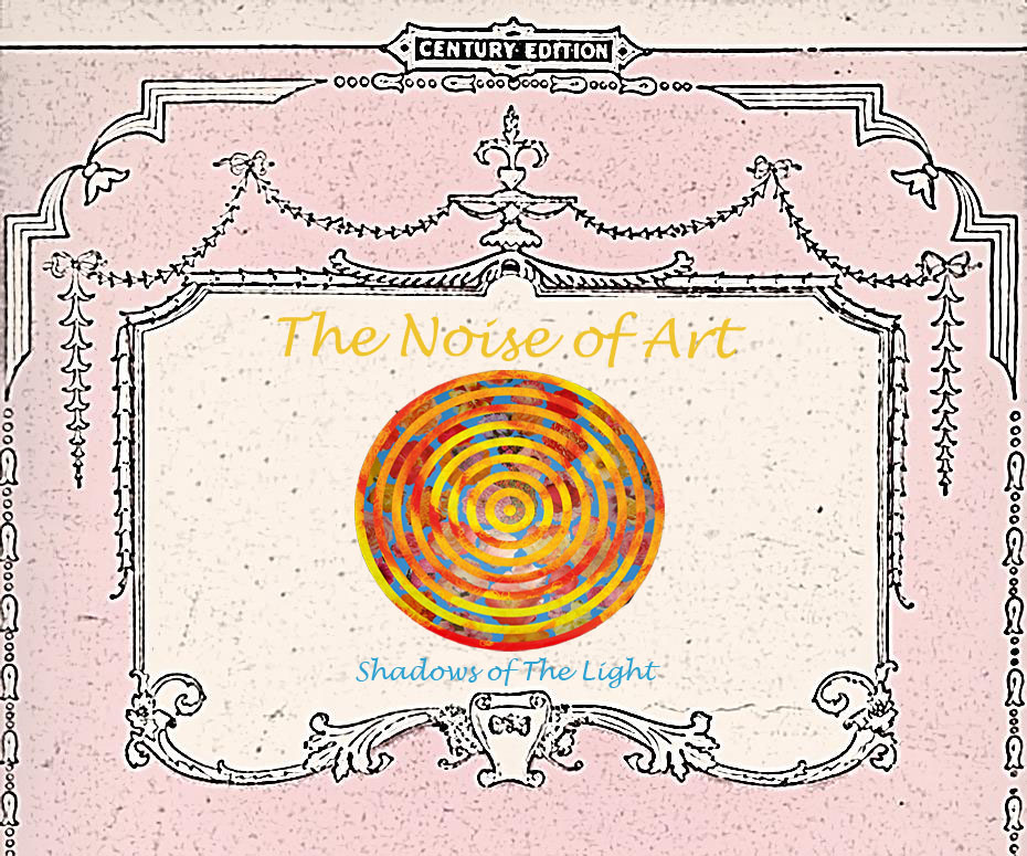
We could say this is our first digipak idea, as it does combine both ideas our group has come up with, of love and fairy tale. Love being the light pink colour, which is always associated with love, and with fairy tale, we took the idea of a Grimm fairy tale book look, having it look quite old and mystical.