https://www.youtube.com/watch?v=Ga_wUd05m44
Tuesday, 5 January 2016


Evaluation Question 2
How effective is the combination of your main product and ancillary texts?
 This is our tour poster in which we made.
Looking at our poster, we shall analyse it singularly and as well as analyse it against our digipak.
As you can see our logo contains bright colours, in order to give you the feel of summer, the whole reason on why we used such colours is due to our feel for summer never to end, so we use bright colours in order for the fans to feel as if Summer is always round.
You then can see the name of our band, 'Noise Of Art', and the way in which we chose that, was thinking about what everyone likes, for example music = noise and art. So we went along with that, music is noise in an art form.
Furthermore with research into what artists do, and how they do a layout of their poster, they always have their name front and center, so it draws everyone in, and we decided to do the same. Looking at the poster overall, we wanted our main image to cover most of the space, as that will be on our digipak, as well as merchandise from the band.

Now onto our digipak, this was the back cover, we felt the summer coloured circle fit well with the grunge looking background, as it shows what our band is about. Another thing is that we took these photos ourselves and they seemed to work well with each other, even with the same editing. In addition the back cover consists of what a back cover should, the list of names and our band logo.

This is our digipak.
Within our digipak you can see we've stayed with the simplistic show of images of the band, we've placed there photos in black and white as our back cover and our front cover consist of lighting, as well as our bright and summery logo. All together our digipak is one big oxymoron, in which the two completely go against each other to the normal world, but through our experimentation, they fit perfectly.

 A small thank you note to our fans too show them how much they mean to us.

This shows our fans when we are next on tour to see them.

Looking at our poster, we shall analyse it singularly and as well as analyse it against our digipak.
As you can see our logo contains bright colours, in order to give you the feel of summer, the whole reason on why we used such colours is due to our feel for summer never to end, so we use bright colours in order for the fans to feel as if Summer is always round.
You then can see the name of our band, 'Noise Of Art', and the way in which we chose that, was thinking about what everyone likes, for example music = noise and art. So we went along with that, music is noise in an art form.
Furthermore with research into what artists do, and how they do a layout of their poster, they always have their name front and center, so it draws everyone in, and we decided to do the same. Looking at the poster overall, we wanted our main image to cover most of the space, as that will be on our digipak, as well as merchandise from the band.

Now onto our digipak, this was the back cover, we felt the summer coloured circle fit well with the grunge looking background, as it shows what our band is about. Another thing is that we took these photos ourselves and they seemed to work well with each other, even with the same editing. In addition the back cover consists of what a back cover should, the list of names and our band logo.

This is our digipak.
Within our digipak you can see we've stayed with the simplistic show of images of the band, we've placed there photos in black and white as our back cover and our front cover consist of lighting, as well as our bright and summery logo. All together our digipak is one big oxymoron, in which the two completely go against each other to the normal world, but through our experimentation, they fit perfectly.

 |
| We used this photo in order to show the relationship between the singers, and how close they are as friends. |


This shows our fans when we are next on tour to see them.
Monday, 4 January 2016
Evaluation Question 4
How did you use media technologies in the construction and research, planning and evaluation stages?
^^ This Tumblr account answers your question.
Evaluation Question 1
In what ways does your media product use, develop or challenge forms and conventions of real media products?
What is form?
Form is a form of dance, like how music is often organised into sections such as genre. The form of a song for example shows the structure and can help the listener relate and understand what the artist is trying to do/say.
What is convention?
To sum it up for you, its a widely recognized way of doing things within a particular genre.

What is form?
Form is a form of dance, like how music is often organised into sections such as genre. The form of a song for example shows the structure and can help the listener relate and understand what the artist is trying to do/say.
What is convention?
To sum it up for you, its a widely recognized way of doing things within a particular genre.
The Genre of our music video was indie pop. The way in which we chose our song was by listening to a variety of different songs and writing down aspects of the songs. We had no idea of the names of the bands/ solo artists nor any idea on the name of the song, although some seemed very familiar.
We then as a group chose to re-listen to some to get the feeling of them, and once talking and re-listening to the song after a while we all decided on the song ' Clean Bandit - Extraordinary'.

After all that it came to the time of decision making on what the idea of a music video for this song will be like, and too admit it was hard, as we were not allowed to refer back to the songs video. Also researching other indie music videos didn't give us much help, so we decided on using on another, and what we felt once listening to the song.
We had 2 ideas, FAIRY TALE and LOVE. And with that we began sprouting ideas, looking at the whole idea of a 'happily ever after' and that's what we had wanted for our music video. We then began to look at disney princess's and which one would suit well, we liked the idea of 'The Princess and the Frog'. and that's where our idea kind of sprouted from, but mixing the gender roles, so the princess would be a boy and the frog would be a girl. But within the filming stages, this was more complicated then planned, so half way through we decided on changing the whole idea, into best friends again having the two different sex roles. And our music video was just going to be based on them and what adventures they get up too.
The music product which we have made consists of a Digipak, Poster/Advert and a music video. This then meant they all had to link, even if that meant the same font or same font size this is because we had to make the product easily recognizable for the fans to see which product belongs to our band. We got ideas from other indie bands such as 'Years and Years' and 'The 1975'.
.jpg)

Evaluation Question 3
What have you learned from your audience feedback?
https://prezi.com/uqh3fmsgmt9n/evalution-question-3-what-have-you-learned-from-your-audience-feedback/
Rough Cut Evaluation
Feedback :
The class did love our ideas, and liked the video we pieced together, they liked the variety of shots and the quality of the camera made our video look proffesional. They also did like the the fact how the lipsyncing bits were in time with the song and how the whole idea matched with the song.
- Mahira is over exaggerating in one small part, and the class would like us for her to make her reaction more naturalistic
- Where the song starts the character should be seen lip syncing rather than a nature shot.


Diary Entries - Filming
https://www.youtube.com/watch?time_continue=37&v=CA8LJWdxt9s
(The link above does say a little about what we done and what we had used as well as how effective it was.)
11.12.15 - Mufti Day
As it was only me Ramneek and Ansa in today, we filmed short bits of Ramneek with his friends, because of course Mahira isn't his only friend, but is his main friend, so we wanted to show the contrast of how he is with his friends and then with Mahira. It was perfect, as we had mufti day, so it seemed like the boys were just out with one another. We did side on shots of the boys talking, as well as them walking and talking towards 'their bench'. Something Miss Carter picked up on was that one of the boys was wearing his ID badge, and that small error shows that he is in school rather then out with the boys, but as we did not have much time, I don't think we will be using that small shot of them.
14.12.15
Dear Diary,
Today Ansa was in charge, and we had Mahira do her lip syncing. As from the class our feedback on one part of the video, was that Mahira standing infront of a tree with her glasses on and in formal clothes. The class and miss Carter said it changed the atmosphere of friends into more of a formal outlook, so we had changed that into her without her glasses (otherwise it wouldn't go along smoothly with the rest of the video - she has her glasses off throughout the video) but again in that place, to show where she and Ramneek made the most memories.
16.12.15
Dear Diary,
Today after school we had focused filming Ramneek and Mahira's friendship bit. We had gone onto the back field and had them shoot hand shakes and hugs (which represent what friends do). Also within this bit of shooting, the video will show you how much their relationship has progressed, with them talking by themselves, flirting and even sharing a laugh or too. Me and Ansa were in charge of camera, and took a variety of shots, including; long shots, closeups, medium shots, and even low angle shots. I did enjoy taking close ups of them two, again to the audience it shows how close they do grow as friends. Another thing we shot today was transitions without the song, which I feel really go with the song, and the story.
(The link above does say a little about what we done and what we had used as well as how effective it was.)
11.12.15 - Mufti Day
As it was only me Ramneek and Ansa in today, we filmed short bits of Ramneek with his friends, because of course Mahira isn't his only friend, but is his main friend, so we wanted to show the contrast of how he is with his friends and then with Mahira. It was perfect, as we had mufti day, so it seemed like the boys were just out with one another. We did side on shots of the boys talking, as well as them walking and talking towards 'their bench'. Something Miss Carter picked up on was that one of the boys was wearing his ID badge, and that small error shows that he is in school rather then out with the boys, but as we did not have much time, I don't think we will be using that small shot of them.
14.12.15
Dear Diary,
Today Ansa was in charge, and we had Mahira do her lip syncing. As from the class our feedback on one part of the video, was that Mahira standing infront of a tree with her glasses on and in formal clothes. The class and miss Carter said it changed the atmosphere of friends into more of a formal outlook, so we had changed that into her without her glasses (otherwise it wouldn't go along smoothly with the rest of the video - she has her glasses off throughout the video) but again in that place, to show where she and Ramneek made the most memories.
16.12.15
Dear Diary,
Today after school we had focused filming Ramneek and Mahira's friendship bit. We had gone onto the back field and had them shoot hand shakes and hugs (which represent what friends do). Also within this bit of shooting, the video will show you how much their relationship has progressed, with them talking by themselves, flirting and even sharing a laugh or too. Me and Ansa were in charge of camera, and took a variety of shots, including; long shots, closeups, medium shots, and even low angle shots. I did enjoy taking close ups of them two, again to the audience it shows how close they do grow as friends. Another thing we shot today was transitions without the song, which I feel really go with the song, and the story.
Step by Step of Poster/Digipak
Poster:
- I started off with paint, and had used a lighter tone of black for the background.
- Looking into other indie bands, I liked the idea of the white border, to have the fans glued to the middle of the page focusing on the band then looking elsewhere. (Did again with paint)
- With the font, it was easy enough to again stick too paint and see what matched, as a group we went back and forth with different fonts and decided Lucida Handwriting and Roman Apprentice worked well with each other.
- With the circle, I used photoshop, in which I got photos off the internet of different flowers, and had cropped them in a circular shape, making sure to make them different layers, and once I had done that with one of the photos, I did the exact same with the second. I then placed the layers on top of each other. I did this till I got to the same width and length of our first logo. I also used a brightening tool on Photoshop to make the red flowers pop against the blue background. Also with every other red circle, I blurred them, I was just going through each effect within photoshop and it seemed blurring every other red flower circle just worked.
Final Poster

How we improved our poster to end to this result, was with sticking with the colour scheme of the font, and again sticking with two different fonts. The idea of the two fonts is because of our ideas, fantasy(fairytale and love) both contrast nicely with one another, and this goes along with our fonts for our poster. We've also made one of our own idea of the circles, mixing the idea of flowers seemed to work (also the previous circle also consisted of flowers). We changed the colours slightly, but made sure they seemed to match with our old idea. Also another thing i did, was that i made the background all one colour, unlike our previous idea, which had a lighter version of black as well as black, and it just didn't look neat nor professional.

Digipak draft 2 Branding
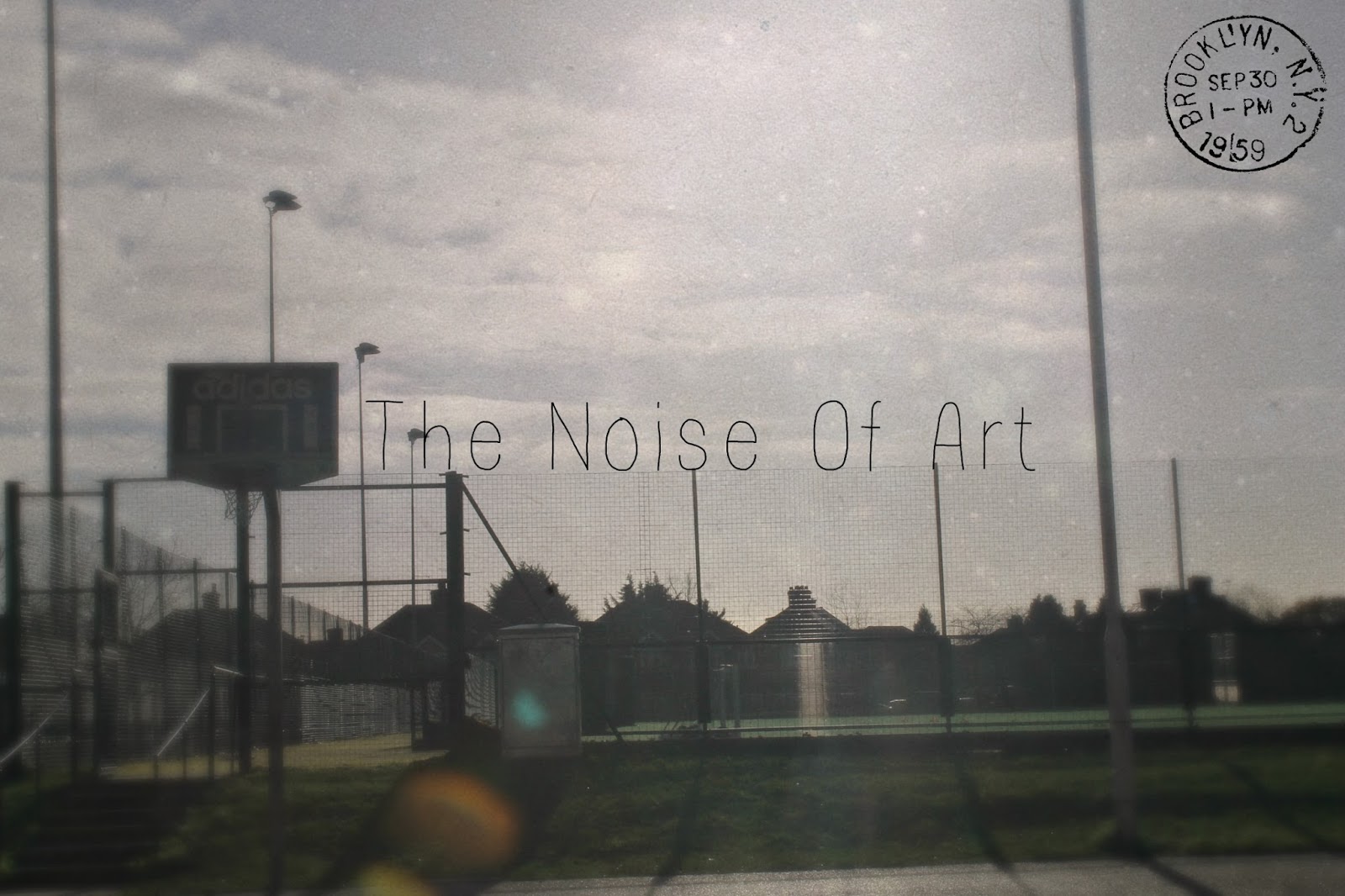
We then good feed back from the class, and what really stuck out to me, was the fact that the photo we had was not our own photo. We then thought too research the most common factors of an indie pop band cover, and it seemed to be really blurry pictures with just the fixture on the middle, a post card type cover or even just a simple photo of the band in a naturalistic background. Out of all the photos we took, I feel this picture captured the name of our band perfectly, as well fitting too the criteria of an indie band. The only thing that I forgot to put was our logo we had stuck with from the beginning, it was hard matching it to the picture, so i decided to swap it with a small stamp, as if the cover was a postcard.
With the inside of our digipak, we left the idea of a book behind, and kept it nice and sleek, with having black backgrounds with photos of the singers on the inside, and as well as having a sweet thank you note from the band and having a page telling the fans of the upcoming dates.
Digipak draft 1
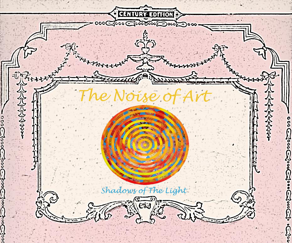
We could say this is our first digipak idea, as it does combine both ideas our group has come up with, of love and fairy tale. Love being the light pink colour, which is always associated with love, and with fairy tale, we took the idea of a Grimm fairy tale book look, having it look quite old and mystical.
Thursday, 17 December 2015
Music Video 'rough cut' & Rough cut evaluation 2
Feedback:
- The camera was good and steady.
- Camera quality was the same and clear all the way through.
- With the dancing scenes, they're good, better than before, but we need to do more cuts between them, showing both scenes for the same amount of time.
- The amount of shots doesn't fill out the time of the song (more shots needed to fill the song out).
- Lollipop scenes with Mahira need to be changed, as the lollipop doesn't seem proffesional.
- The scene with Mahira by the tree needs to be taken out, as it doesn't suit the rest of the clip.
- More nature shots (filler shots)
- Show a contrast of Ramneek and Mahira shots.
- Add an end shot of Ramneek and Mahira to show the relationship (this will relate to the love theme we are going for).
Creative decisions essay
Describe how you developed research and planning skills for media production and evaluate how these skills contributed to creative decision making?
Refer to range of examples in your answer to show how these skills develop over time.
Throughout the planning and research stage of my coursework, I have used a range of skills to ensure creative decisions have been made to make my music video different and original. One of the first pieces of research I conducted was into genre. We had first looked at the genres that could link to a music video, and also what we stereotypically found in most songs nowadays. We found out that they were Indie, pop, rock and r&b. This is how we had chosen our song, by listening to a range of different songs and writing whether we liked it or not, and which genre it had come under. Once we had picked our song Clean Bandit - Extraordinary, we then did further research into what bands seemed to be similar to them, and from this the closest band to relate to 'Clean Bandit' is 'Years and Years'. They had the same feel too their music, very peppy and upbeat. Although Clean Bandit does a variety of different paced songs, fitting every emotion. Whilst years and years stick to what they're good at; with lively and feel good music/songs. From this research we can incorporate their band characterisitics to our band, to fit with the genre of music, as well as it being a blueprint to what we are working up too.
From the research we had gathered, we had decided that we needed a little more information on what our target audience liked within music. We had conducted a questionnaire to help us with this, and from our questionnaire we had gathered that 85% of 16-25 aged people preffered the lyrics to match the music video. Also they seemed to be fond of an adventure and love themed video, with over 80% of our participants ticking these boxes. We now know for our main music video idea we are going to use these music themes. Linking this back to the question, it has helped broadened our creative decision on what themes our music video should include, as well as giving us a insight too what our audience prefer.
Refer to range of examples in your answer to show how these skills develop over time.
Throughout the planning and research stage of my coursework, I have used a range of skills to ensure creative decisions have been made to make my music video different and original. One of the first pieces of research I conducted was into genre. We had first looked at the genres that could link to a music video, and also what we stereotypically found in most songs nowadays. We found out that they were Indie, pop, rock and r&b. This is how we had chosen our song, by listening to a range of different songs and writing whether we liked it or not, and which genre it had come under. Once we had picked our song Clean Bandit - Extraordinary, we then did further research into what bands seemed to be similar to them, and from this the closest band to relate to 'Clean Bandit' is 'Years and Years'. They had the same feel too their music, very peppy and upbeat. Although Clean Bandit does a variety of different paced songs, fitting every emotion. Whilst years and years stick to what they're good at; with lively and feel good music/songs. From this research we can incorporate their band characterisitics to our band, to fit with the genre of music, as well as it being a blueprint to what we are working up too.
From the research we had gathered, we had decided that we needed a little more information on what our target audience liked within music. We had conducted a questionnaire to help us with this, and from our questionnaire we had gathered that 85% of 16-25 aged people preffered the lyrics to match the music video. Also they seemed to be fond of an adventure and love themed video, with over 80% of our participants ticking these boxes. We now know for our main music video idea we are going to use these music themes. Linking this back to the question, it has helped broadened our creative decision on what themes our music video should include, as well as giving us a insight too what our audience prefer.
Tuesday, 17 November 2015
Digi Pak Draft
1st Draft

This our frist draft of the cover of our digipak, we've slightly covered the vintage look with the texturised background. Also, the dark background goes well with our peppy lit up title, this is something we should continue with, for our actual digipak.
2nd Draft

Friday, 25 September 2015


Cast List and Photos
Cast List:
Ramneek Singh: Main Boy

Mahira Abbas: Main Girl

Ansa Bhatti: Director & Camera

Razeena Kramer: Camera

Extras:
- Nancy Kukukhail
- Anju Verma
- Meenakshi Ladav
- Larishma Dias
- Simran Karwal
Ramneek Singh: Main Boy

Mahira Abbas: Main Girl

Ansa Bhatti: Director & Camera

Razeena Kramer: Camera

Extras:
- Nancy Kukukhail
- Anju Verma
- Meenakshi Ladav
- Larishma Dias
- Simran Karwal

Subscribe to:
Posts (Atom)